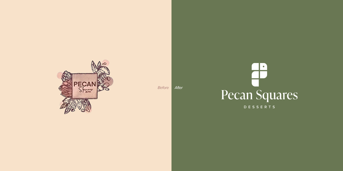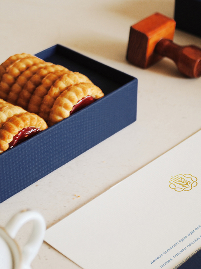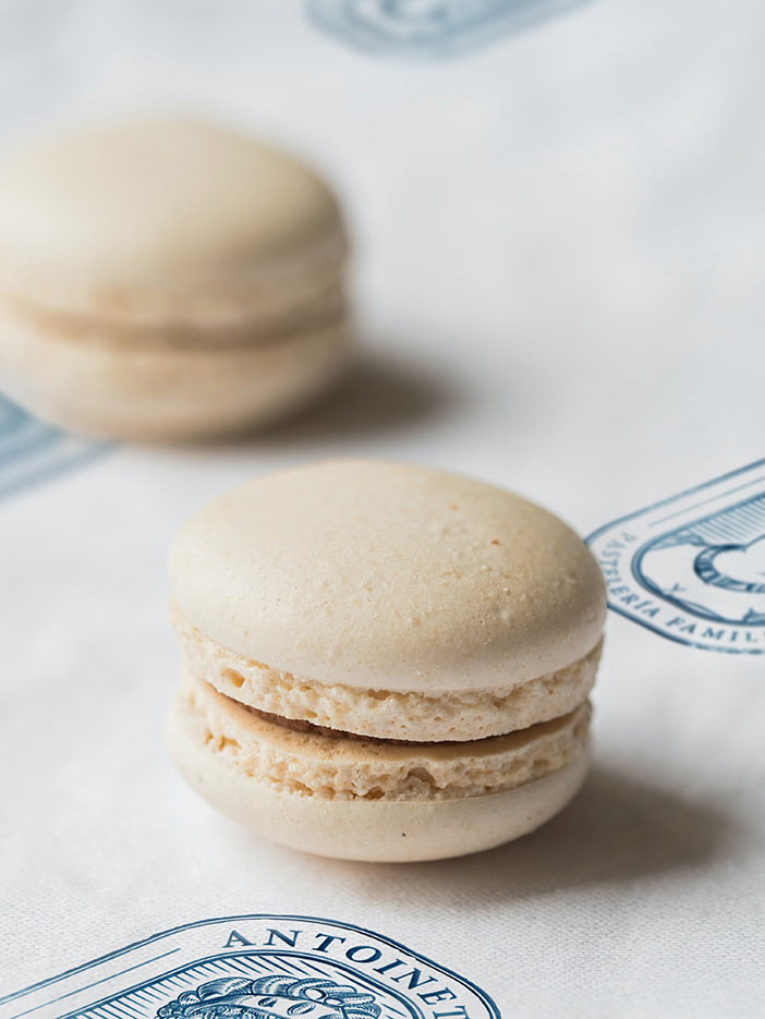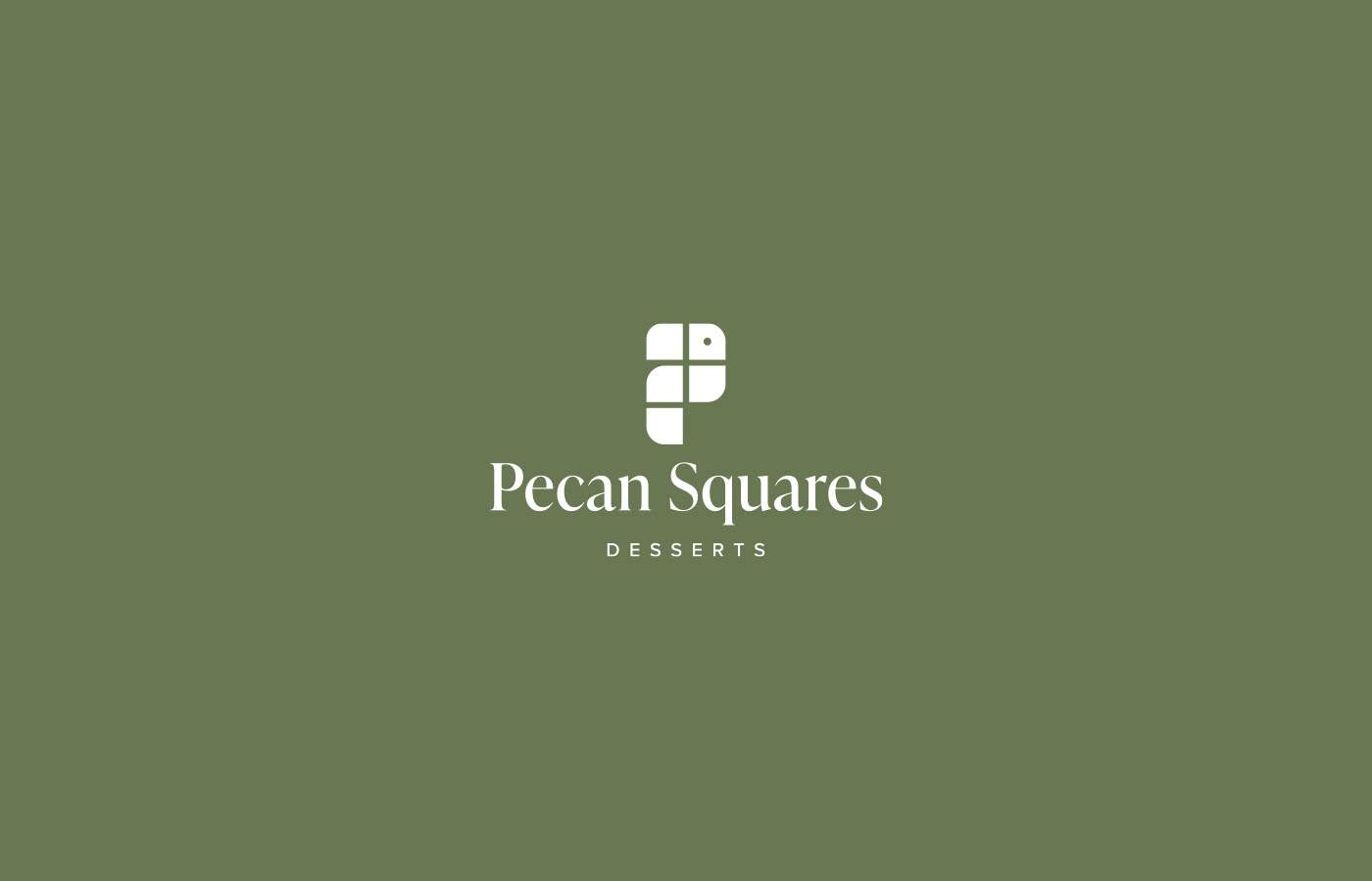
Pecan Squares
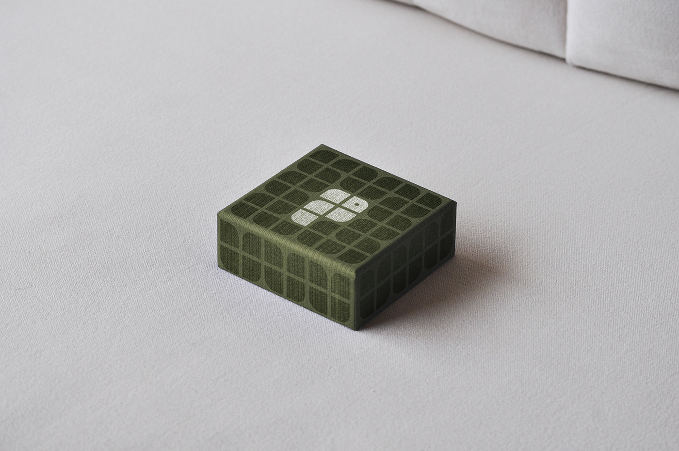
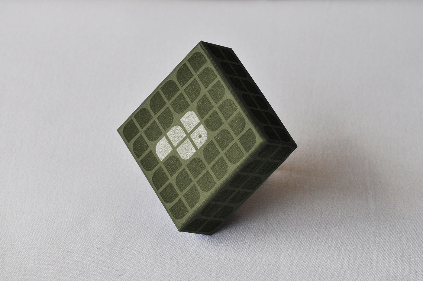
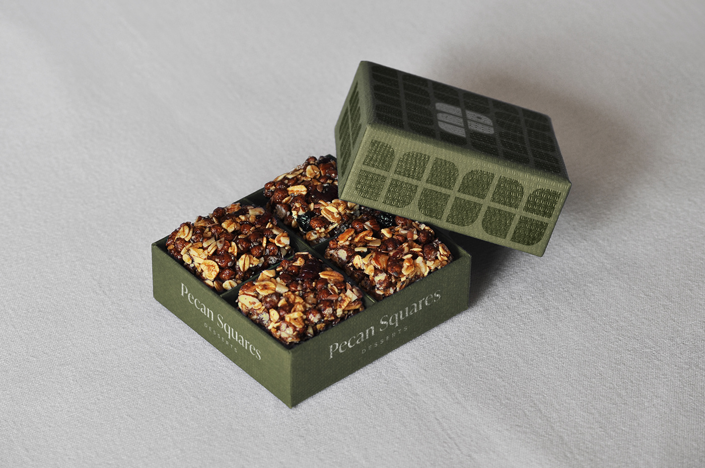
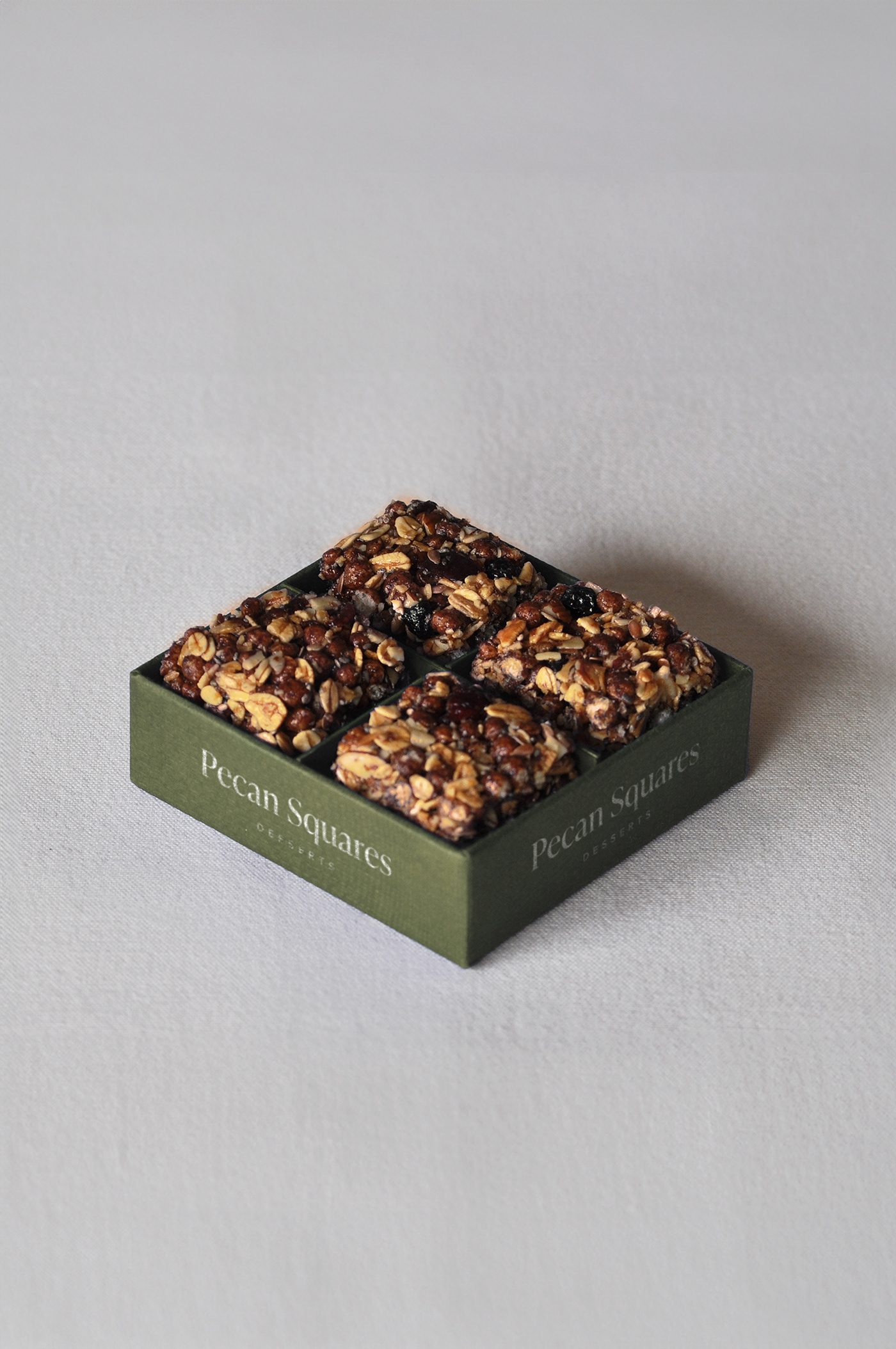
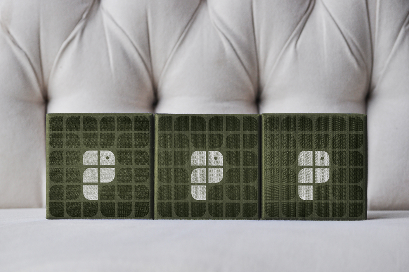
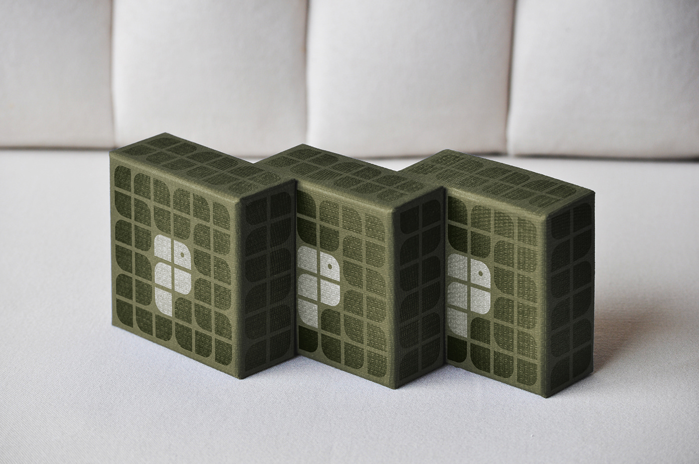
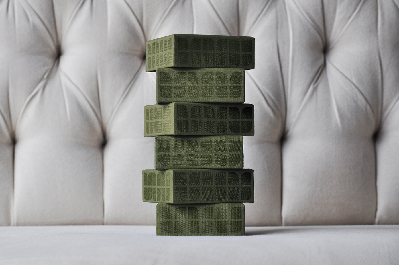
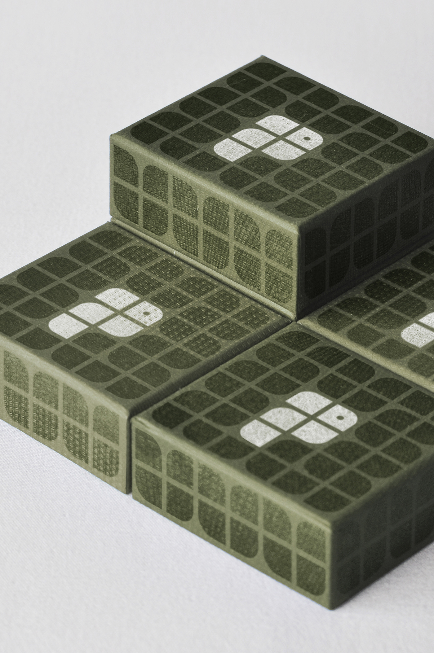
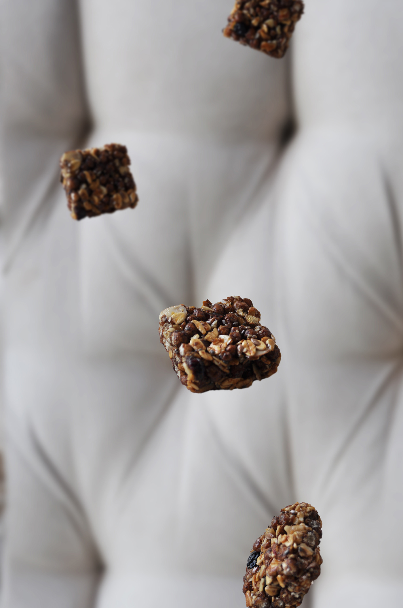
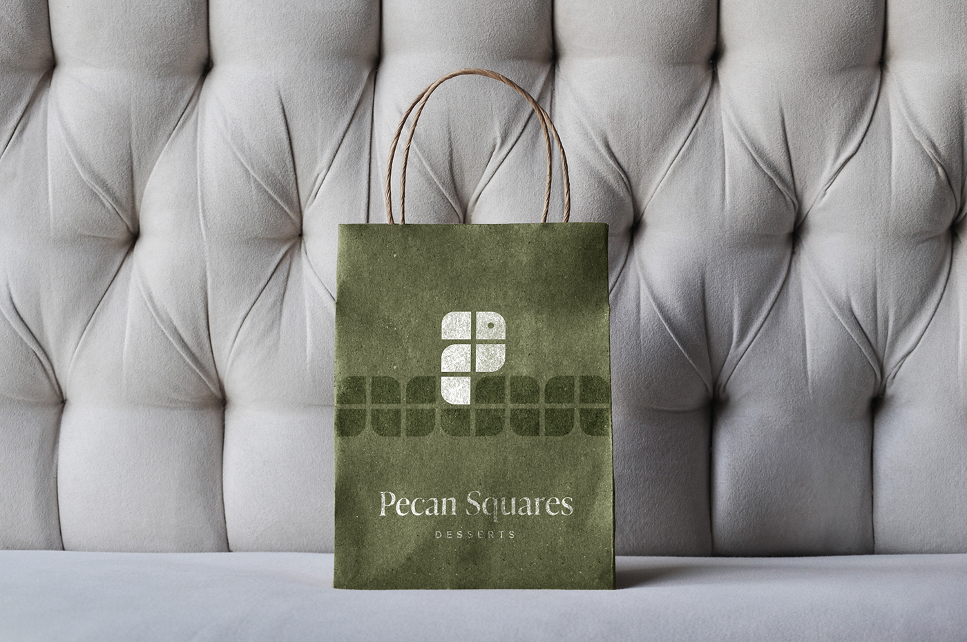
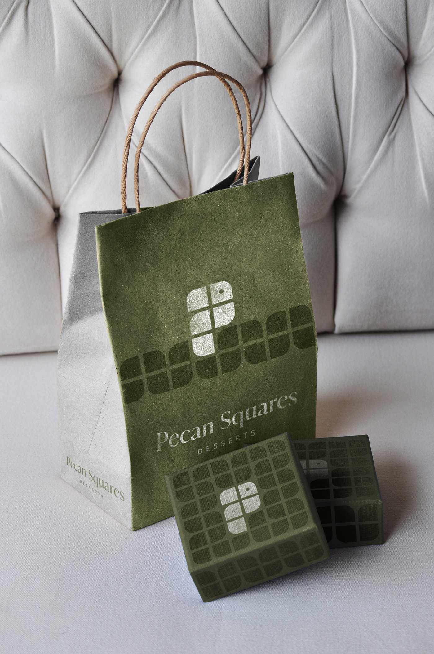
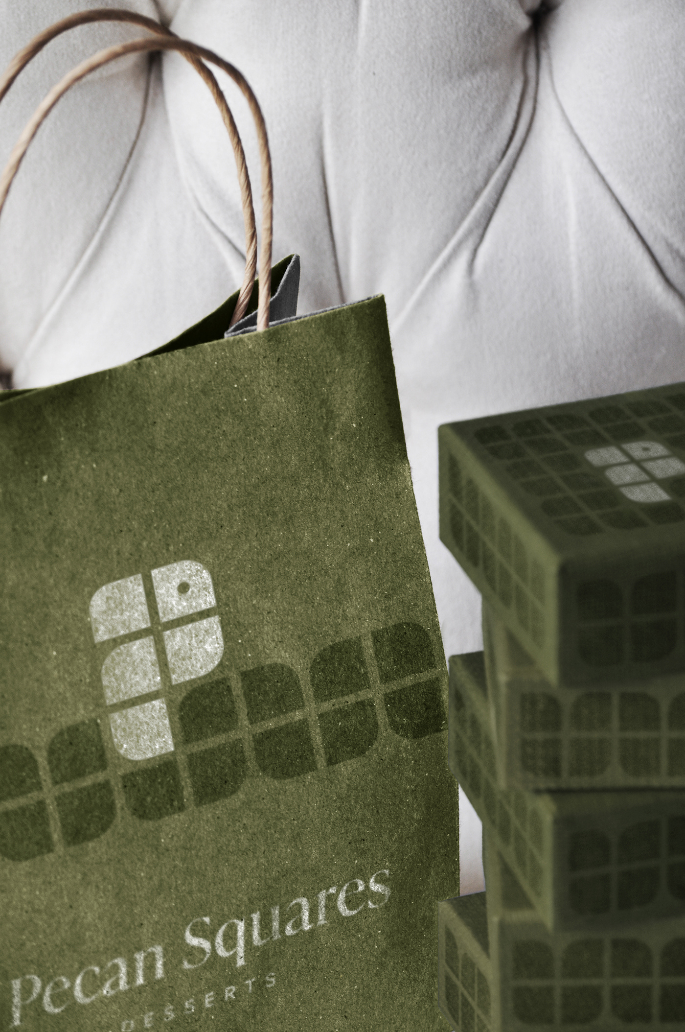
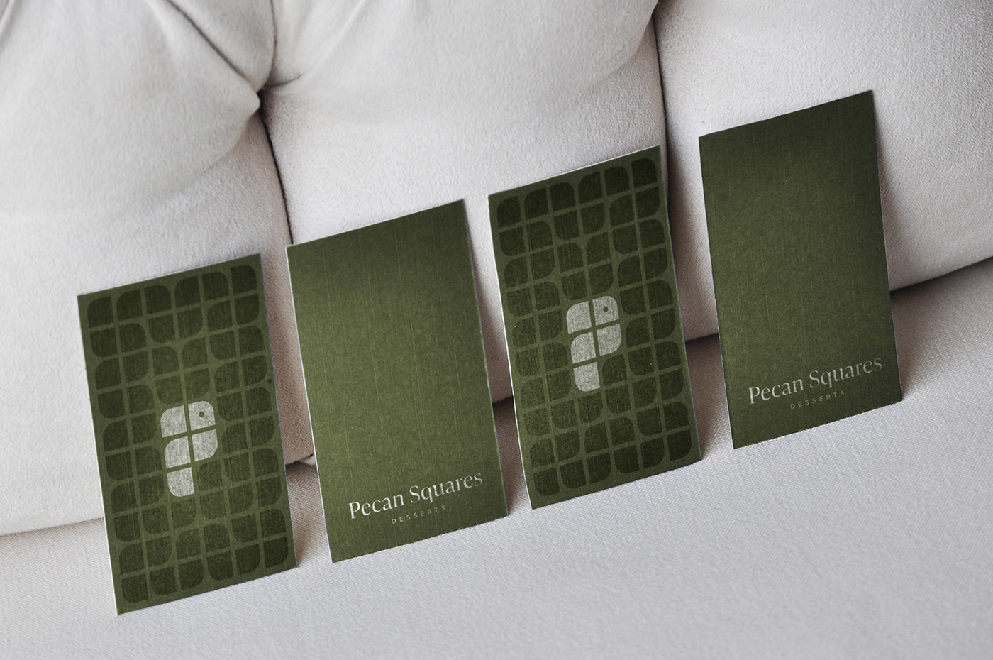
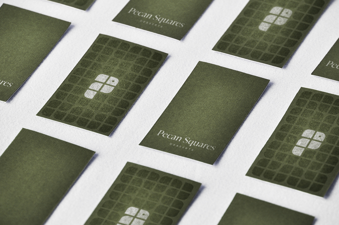
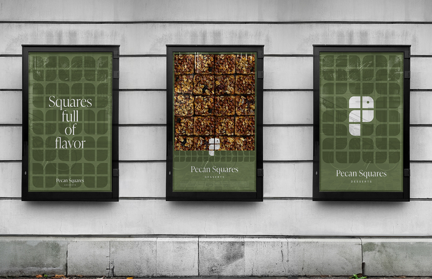
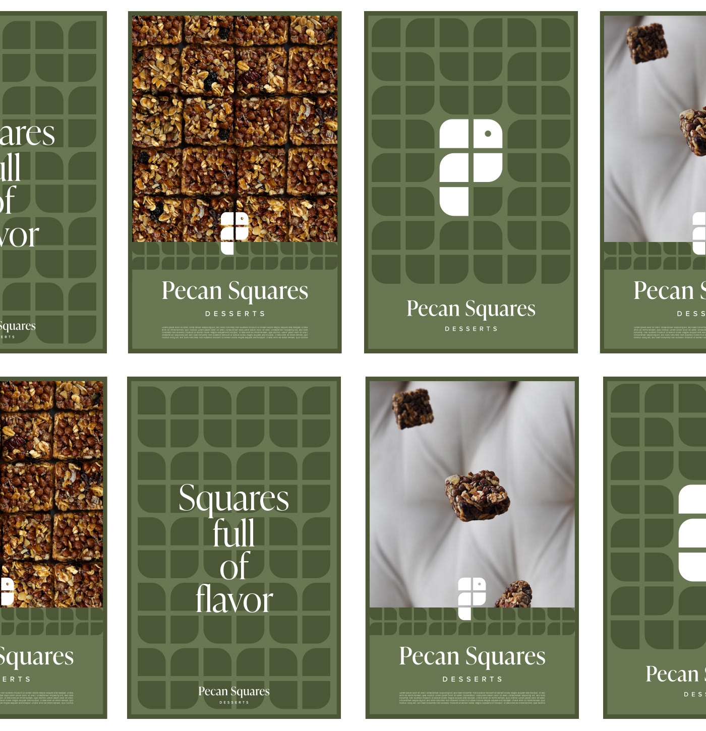
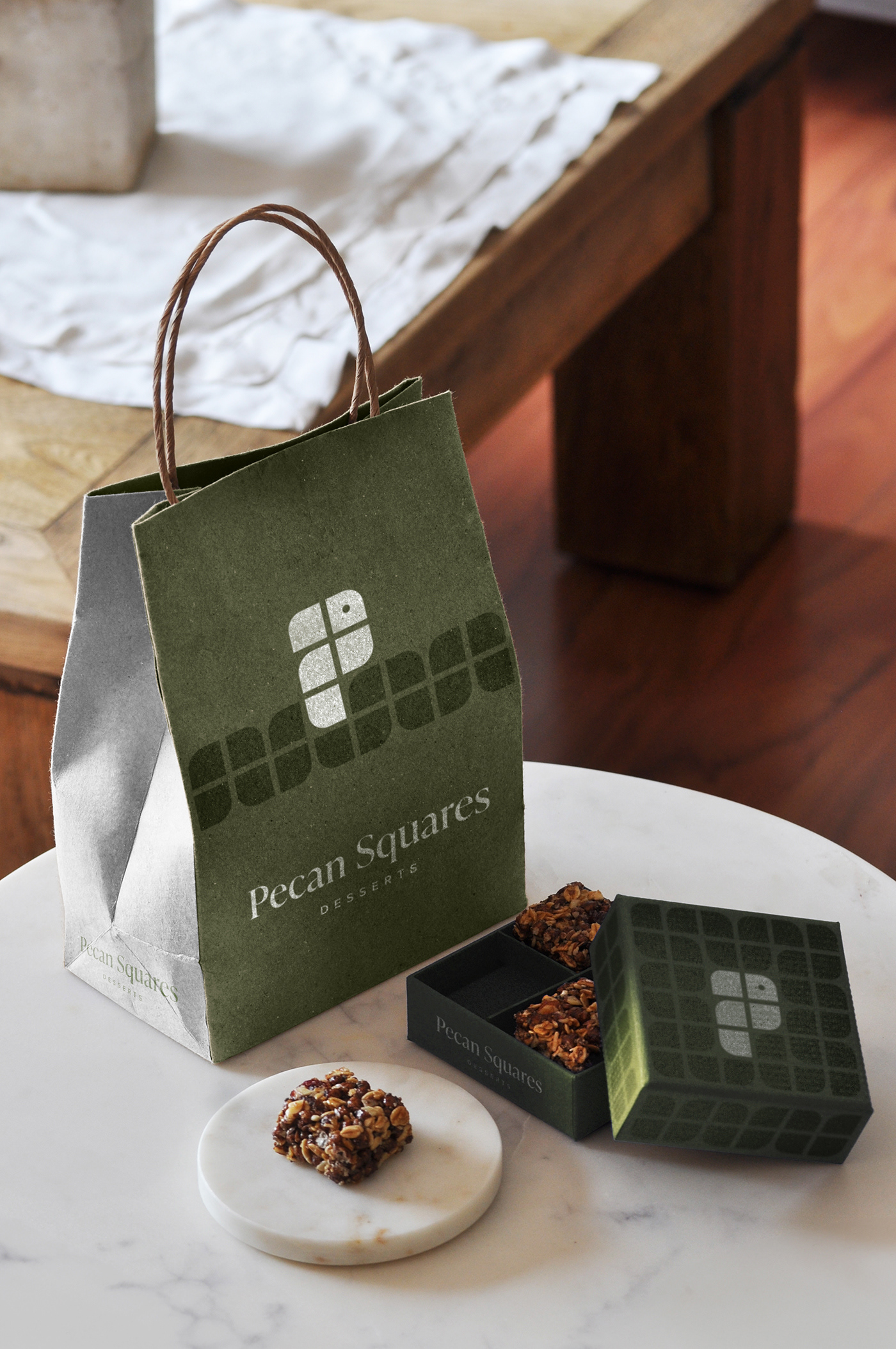
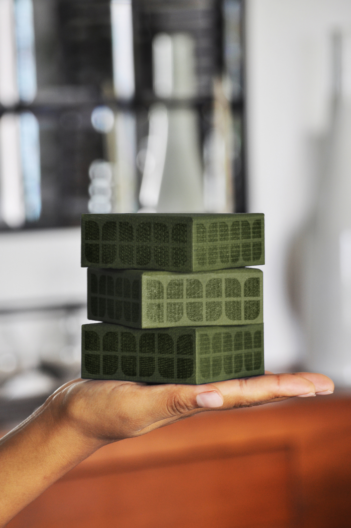
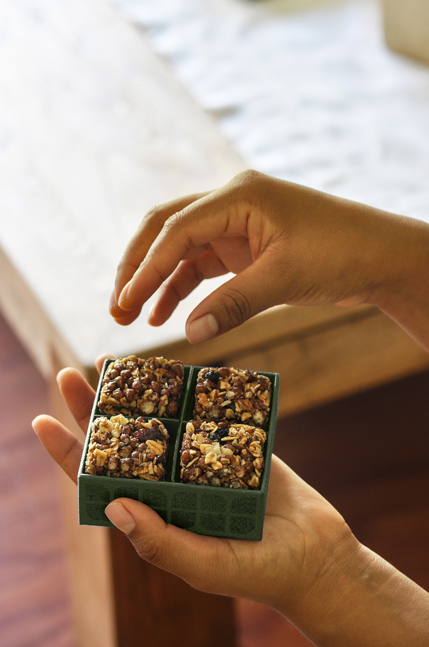
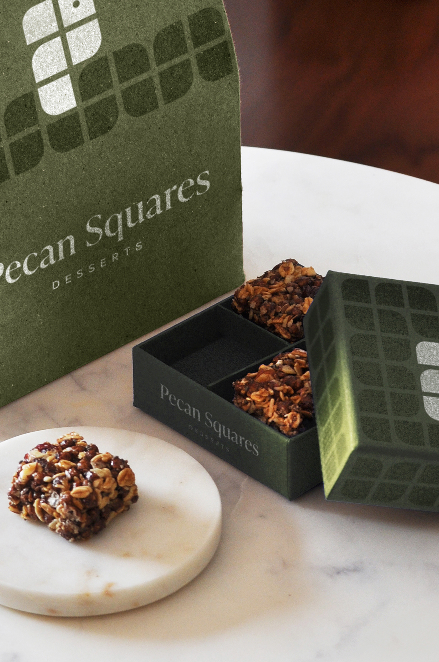
In the process of updating the "Pecan Squares" brand, I obtained a warm and expansive proposal, because in addition to having the letter “P” of “Pecan” implicit in its shape, it presents versatility when it comes to being used in various supports, without mention that its entire construction grid is based on the grid obtained from the "Pecan Squares" of the packaging. In addition to the interesting meaning of the logo, a concept is added that gives dynamism and creativity to the design, this concept is a bird. Through research it was found that there are birds that love the “Pecan”, for this reason I included the shape of a Bird. By using an animal we are giving the brand personality and identity. The live presence of an animal is a good resource to generate warmth and, as an effect, trust. In the materials used for the construction of the branding, the texture stands out. The goal is simple: to add to the visual and gustatory experience of "Pecan Squares" the sense of touch. The color used (customer's choice) is sage green.
Indentity - Branding - Packaging - Photography - Photo editing - Art Direction