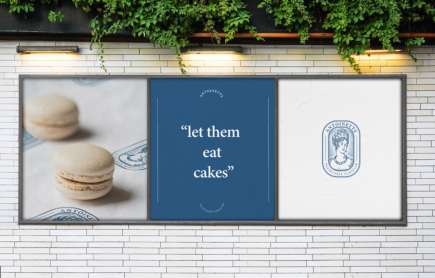
Antoinette
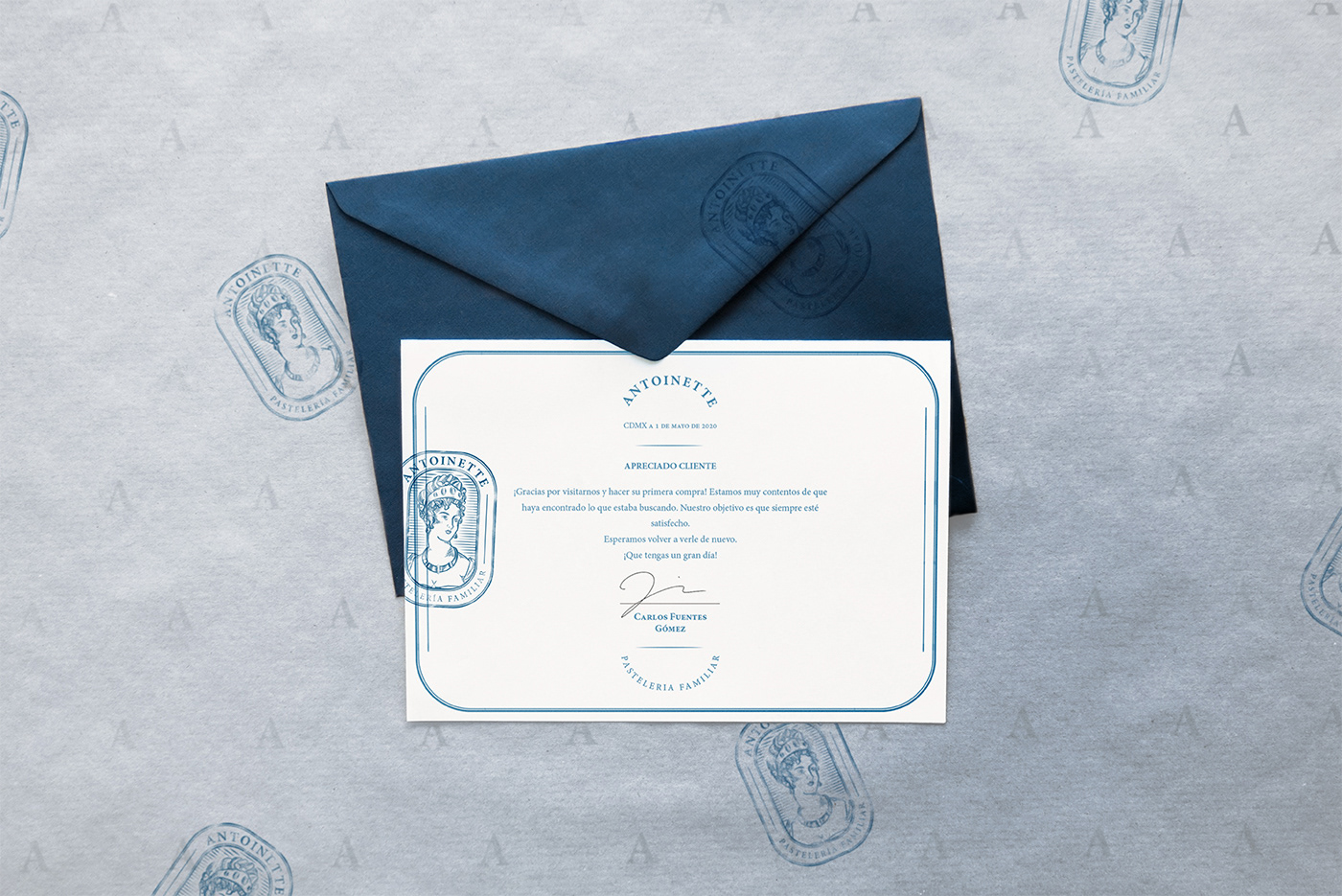
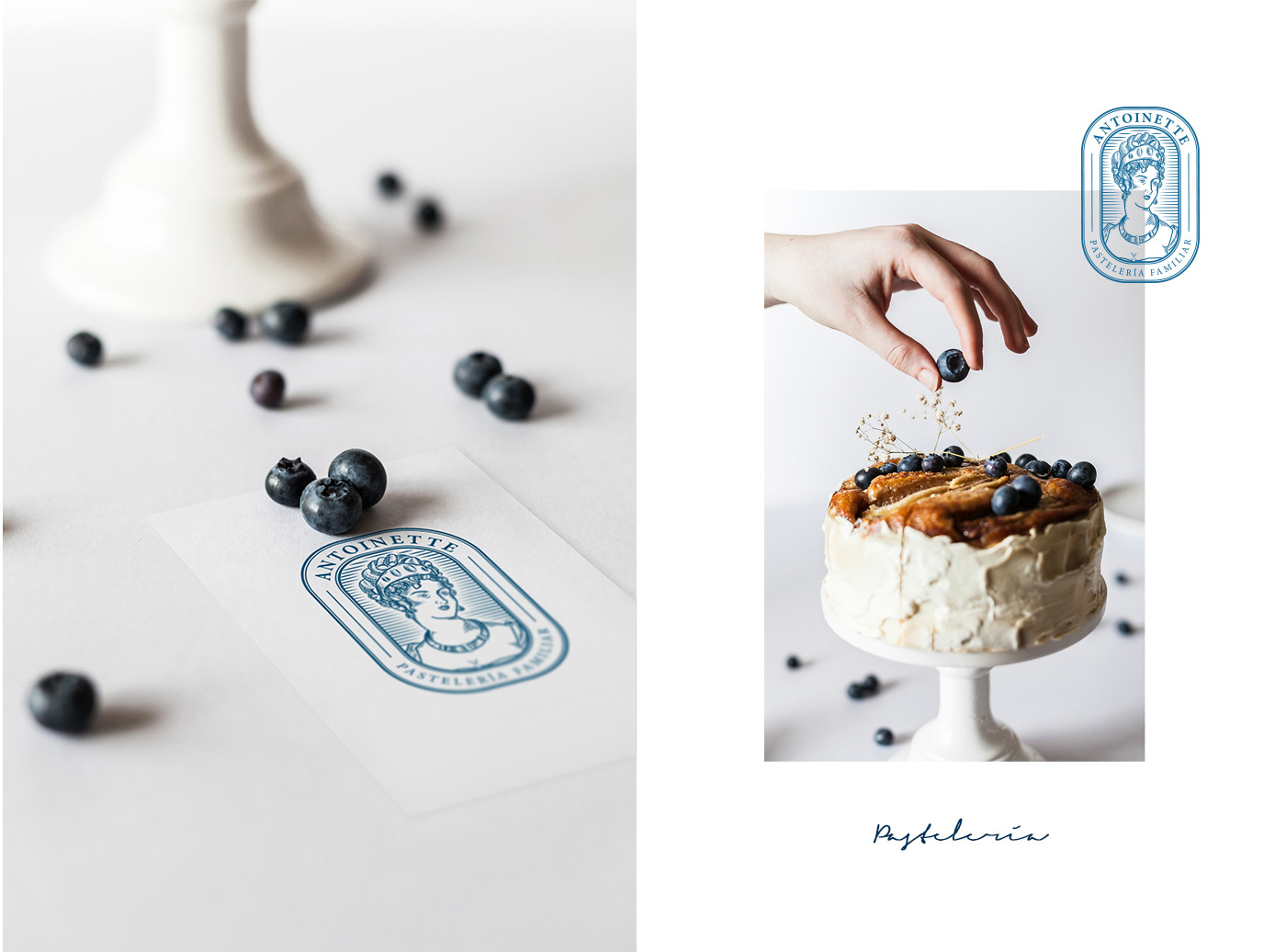
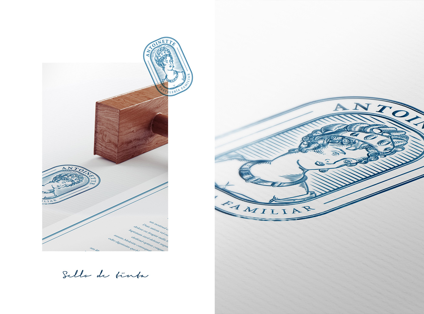
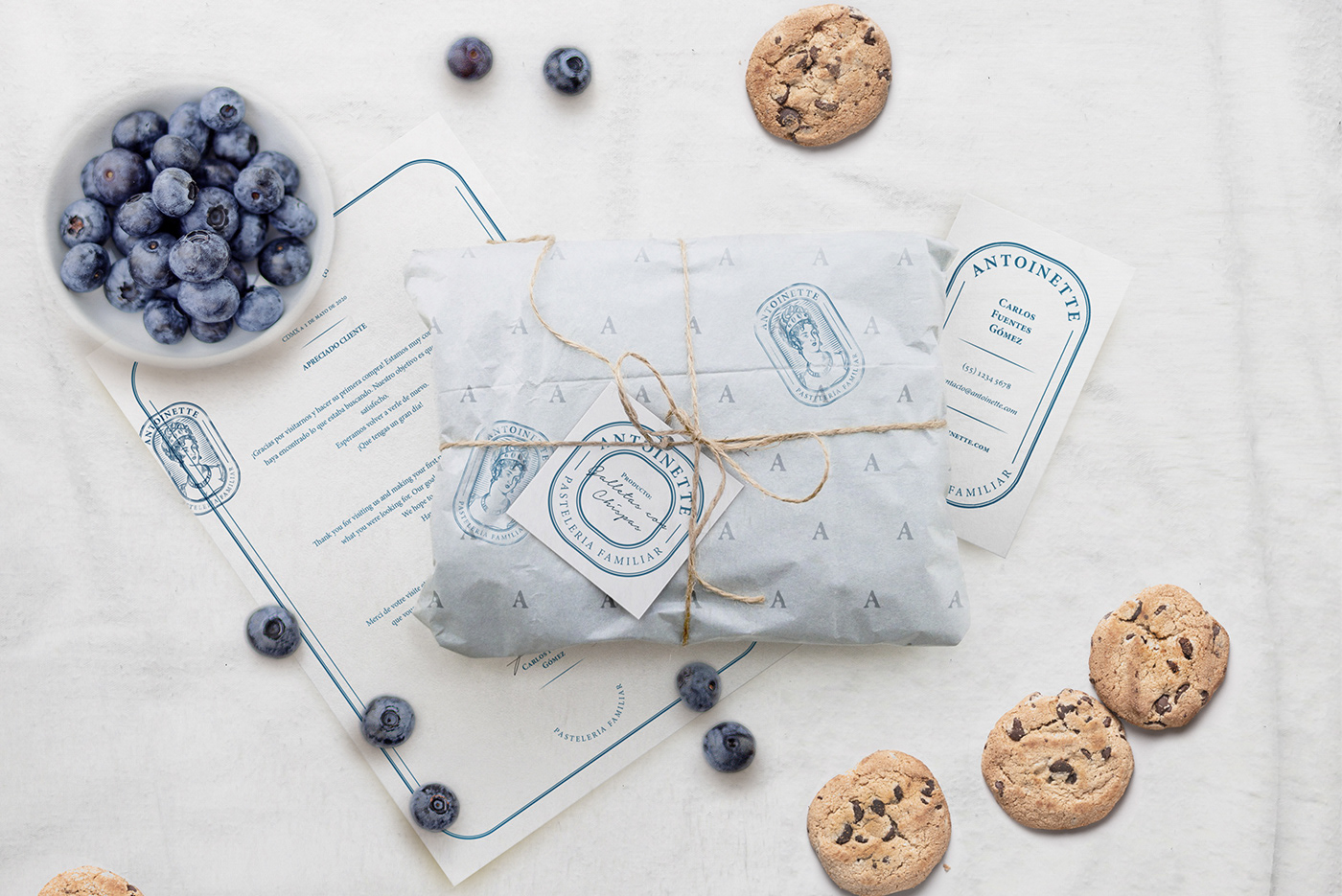
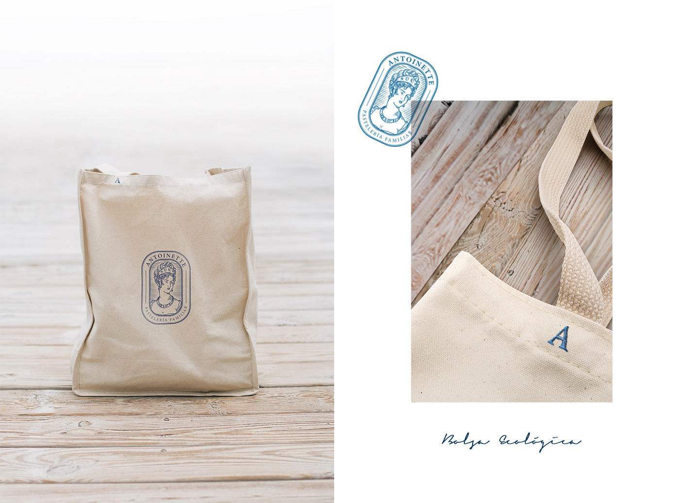
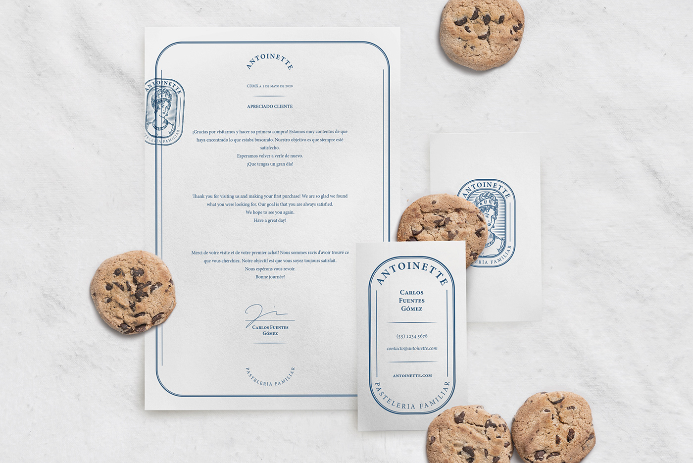
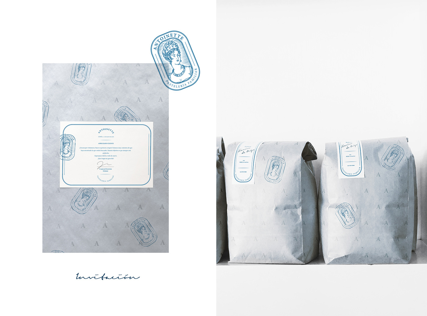
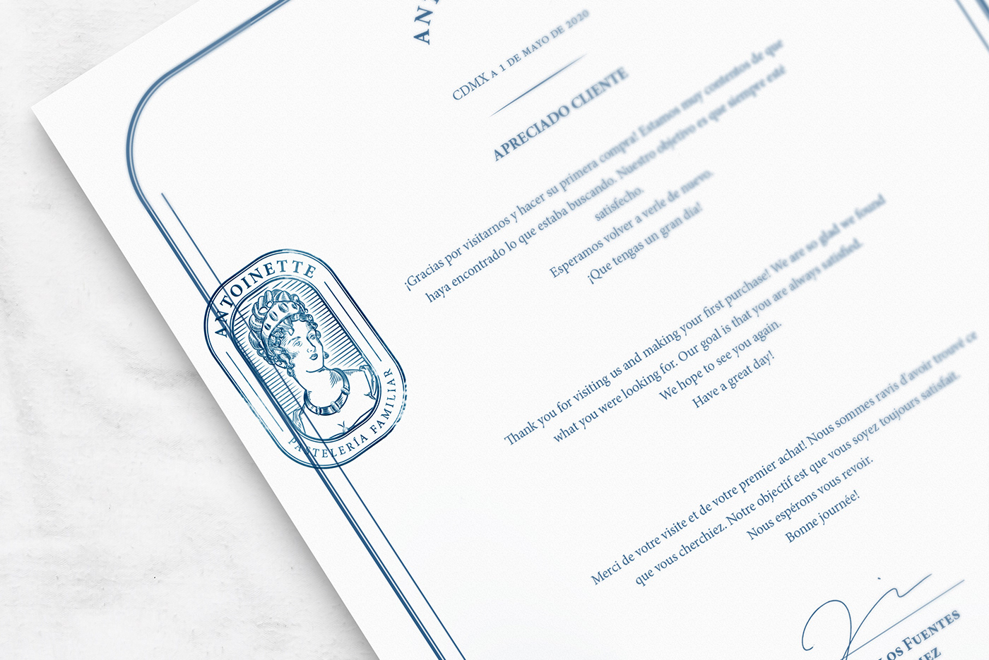
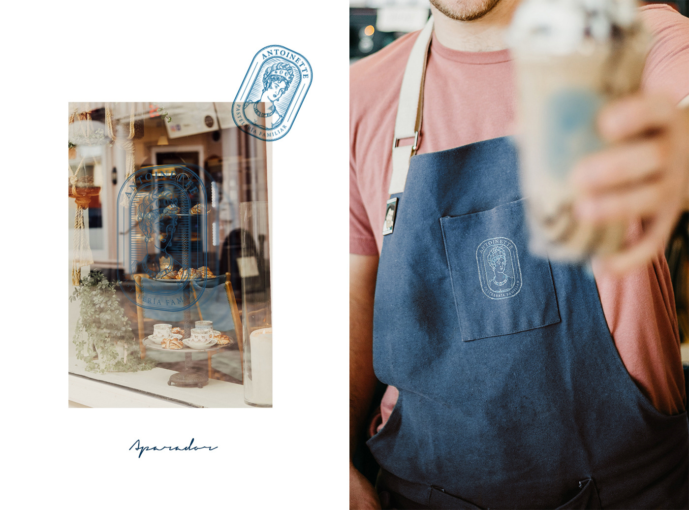
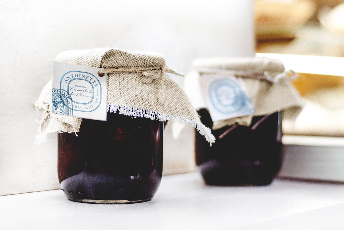
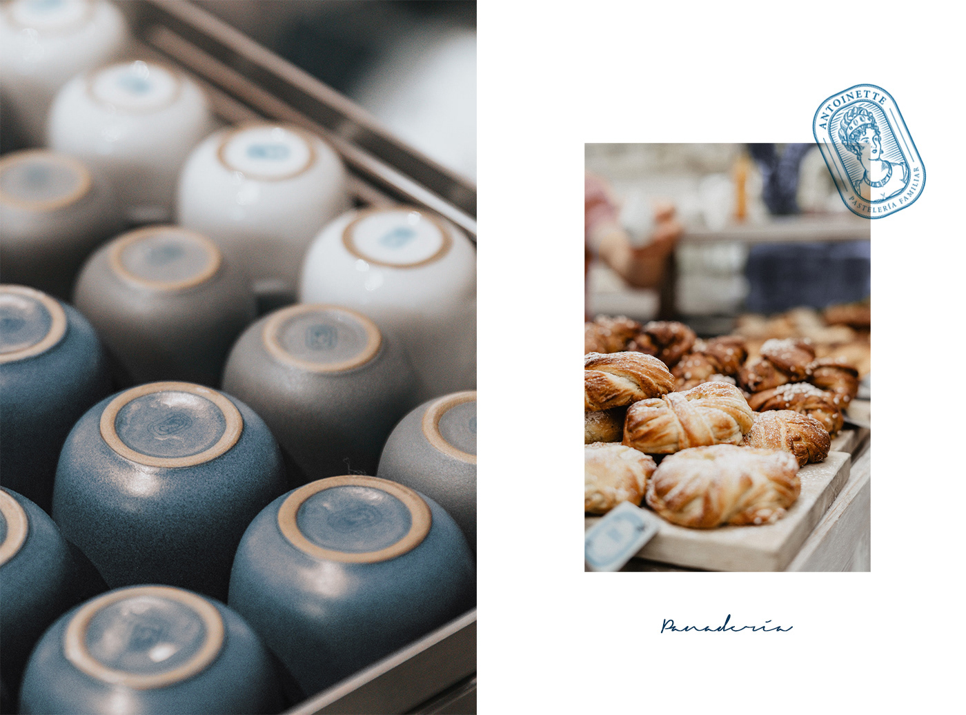
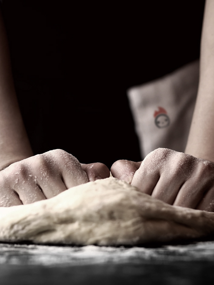
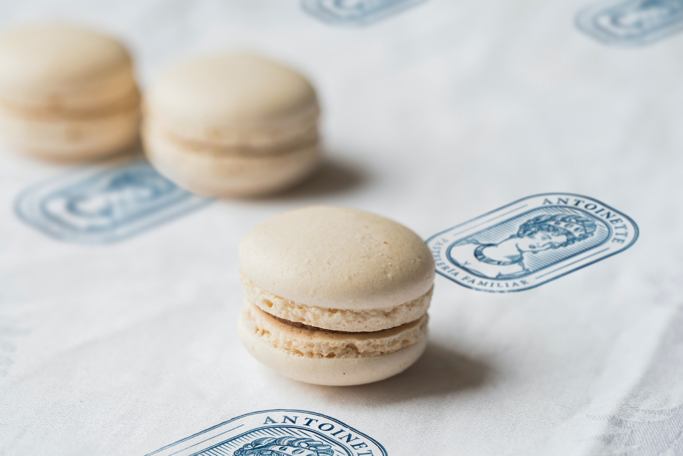
Antoinette is a family bakery located in the majestic CDMX. The delicacies that Antoinette offers are totally homemade, with ingredients worked by hand. The main objective was to emphasize the "artisan" concept, I decided to use the engraving technique to give it a rustic, homey touch, while preserving the elegance and sophistication of the establishment and the iconic figure to be represented. The graphic symbol used to make the logo is the abstraction of the famous archduchess princess Marie Antoinette of Austria. Antoinette's connection with patisseries is reinforced in the famous phrase " Qu'ils mangent de la brioche ", generally translated as" let them eat cakes ". The blue tone was used to modernize the brand, but adding pastel shades to express softness, the idea was to connote: “an old patisserie adapted to the present”. I thank Cantera Estudio for giving me the opportunity to carry out this project.
Naming - Indentity - Branding - Art Direction